MEU BERNOULLI
Project description
April 2015
1 year
Education
3 members
Coordination
Product Strategy
UX/UI Prototype
Programming (in partnership)
Testing
Adobe Photoshop
Adobe Illustrator
HTML / CSS / JS
PHP + Laravel
ObjectiveC – iOS
Java – Android
Creating, designing, and developing the Meu Bernoulli platform was a great challenge in my career. In 2015, there were practically no virtual learning environments to support formal education. We were pioneers in the design of product and market launch strategies.
The platform clearly translated the pedagogical areas we have in Brazil into learning tools. There are many systems that are notoriously based on the concepts I created almost 10 years ago.
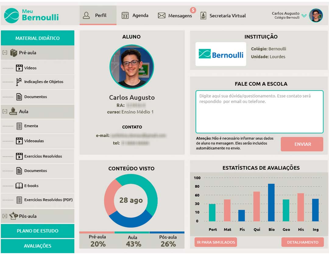
The platform unites important processes of the student’s academic life and automates tasks to help the teaching and learning process:
- Secretariat: agenda, official letters, announcements, registration;
- Personalized Study Plans: a teacher customized the activity proposals that students would perform. The curriculum was gamified with badges and delivery rewards;
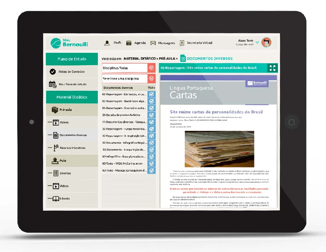
- Learning Objects: hypertext, interactive animations, simulators, games, quizzes, video lessons;
- Tests and Simulations: templates, tests, and test breakdown recordings.
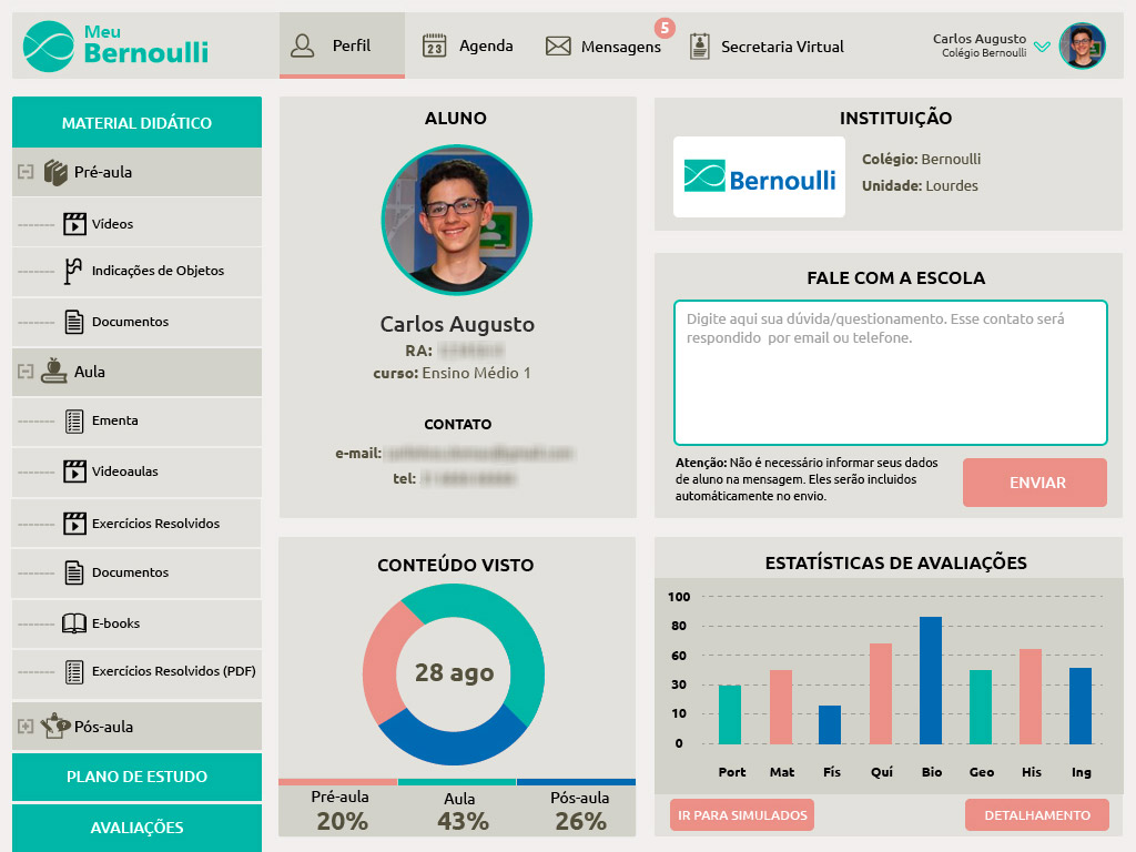
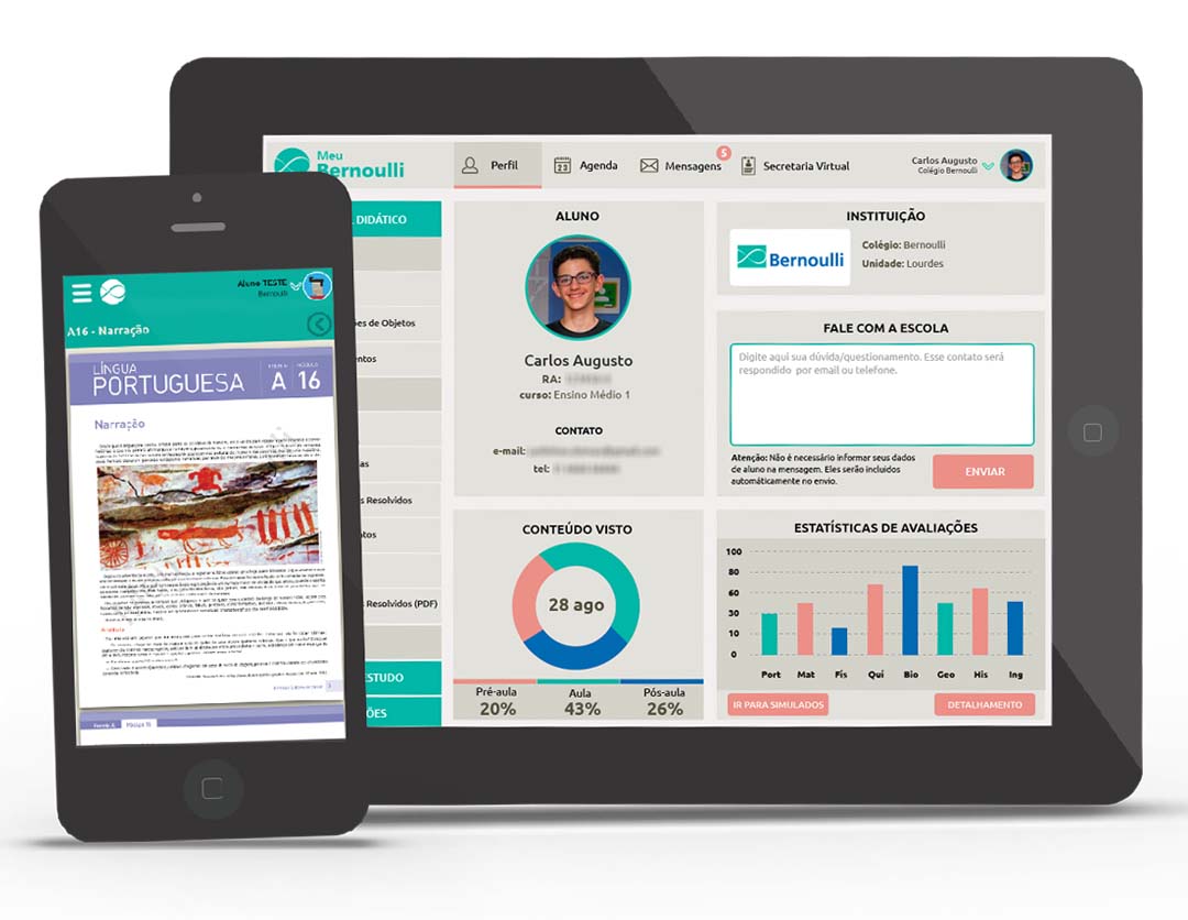
The main mobile device through which the platform was executed was the tablet. We released native versions for Android Lollipop 5.2 and iOS 8. We also had a responsive web version. The smartphone version had specific features such as a student calendar and notes, but the richest functionality was on the tablet. In version 2, we transformed smartphone and tablet versions into a single product, with the same functionalities.
When I started working for the Bernoulli school network, I helped them think about all educational technology solutions. Technological solutions were being implemented for the first time, and we had a lot of freedom to propose initiatives and products. Today I am no longer heading the development of Meu Bernoulli, which is now in version 3, but when I analyze platforms of Brazilian school networks today, I see how pioneering and daring we were in proposing technological solutions at a time when the market and mobile technologies were establishing themselves in Brazil and in the world.
Problems:
The platform had a big challenge: integrating the student’s day-to-day before class, during class, and after class. Thinking about the didactic sequencing of activities was the fundamental pillar of the product’s strategy.
Primary Problem: Create a mobile platform for high school students that enriches the teaching and learning process.
Secondary Problem: What didactic processes and resources of a student’s life can be moved to a digital platform? How to divide student’s day-to-day into pre-class, class, and post-class, creating specific tasks for each environment?
Goals:
- Deliver a good experience on tablets – at a time when there were many different devices and hardware specifications and an interface design for a specific device was required;
- Create a gamification system: badges, challenges, rewards, and ranking;
- Incorporate learning mechanisms: games, simulators, interactive animations, quizzes;
- Be easy to use by the student and the teacher.
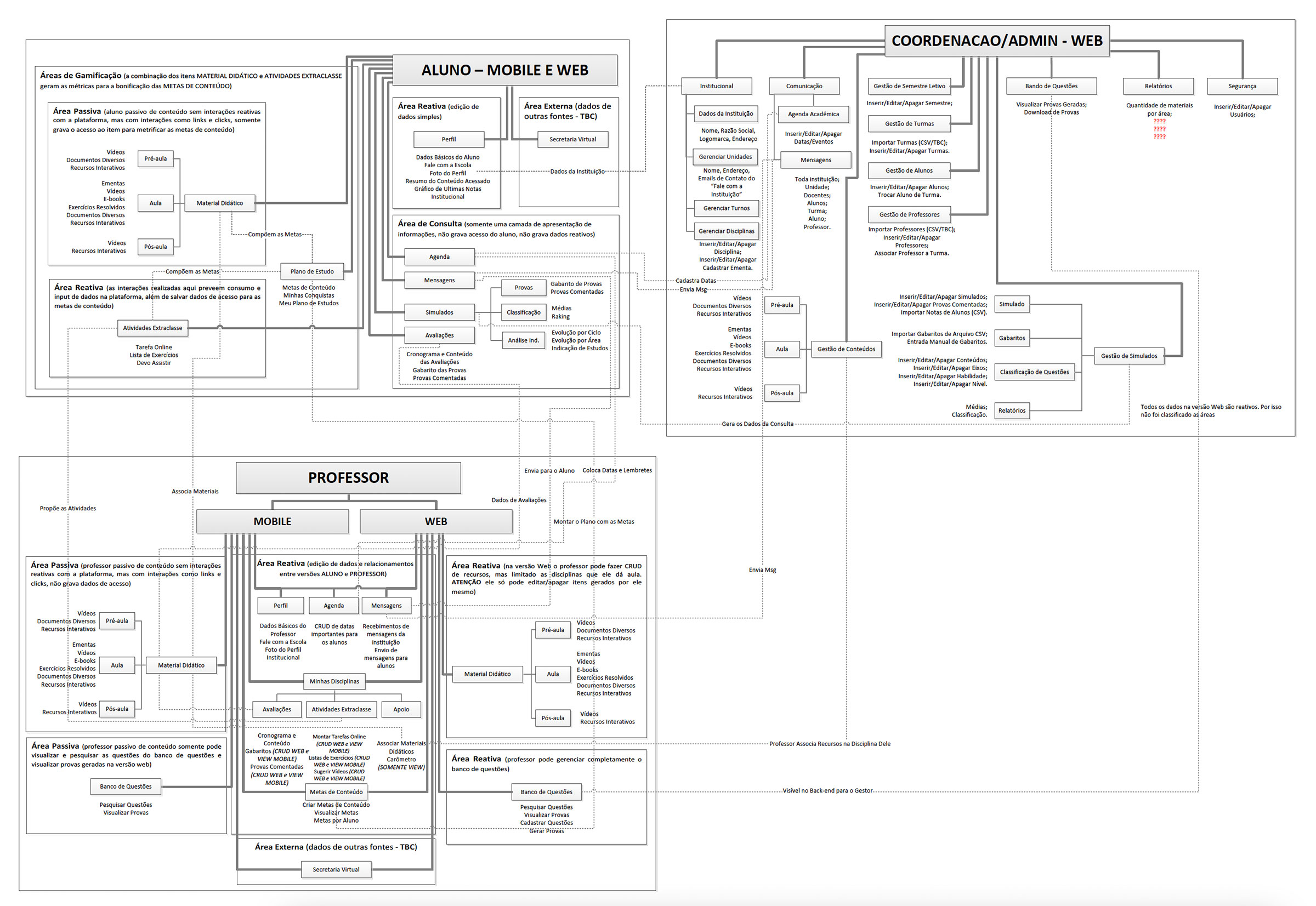
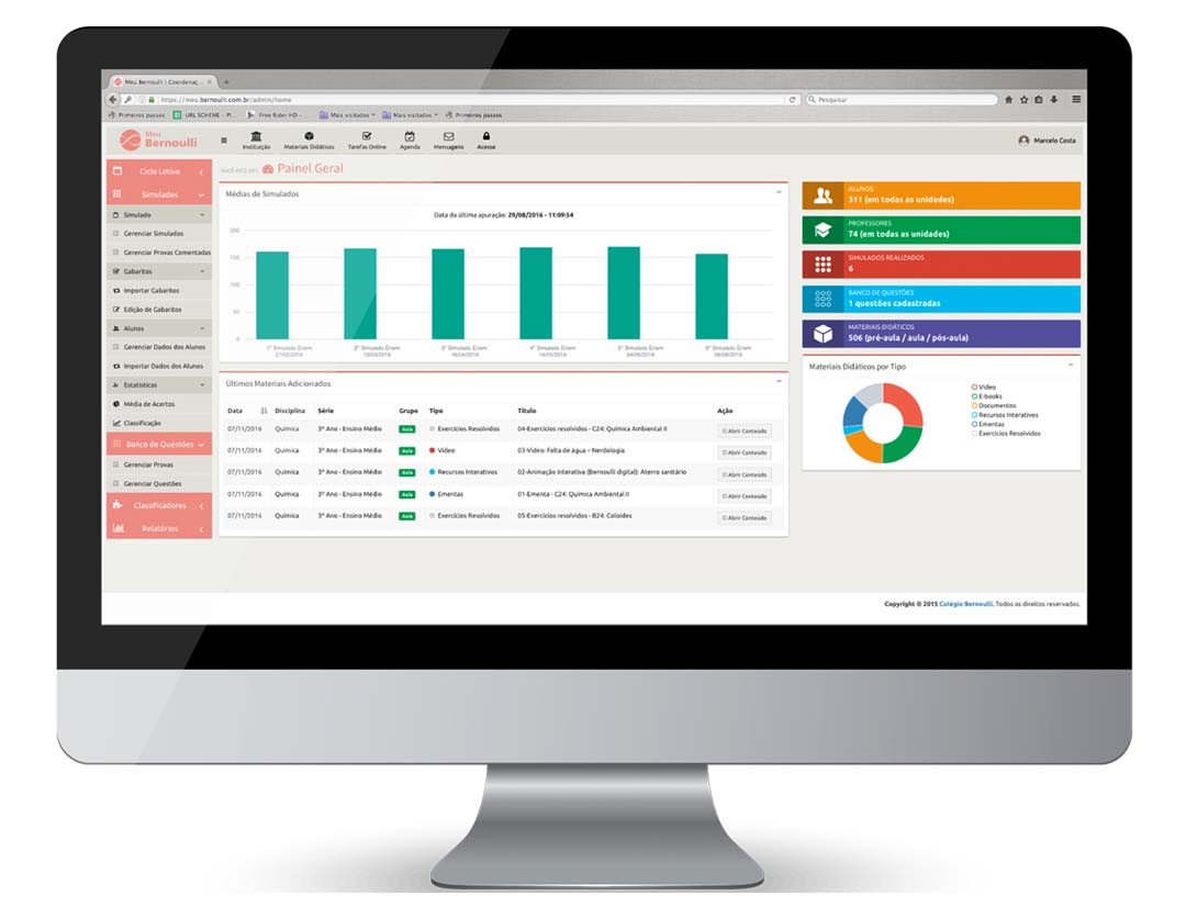
The first phase of the project after establishing specs and requirements was the construction of the information architecture that defined how the system levels were related. It is possible to understand how the instances of students, teachers, and coordination/admin are related. For this phase, we used the Card Sorting technique with groups of students, teachers, coordinators, and developers to find the appropriate taxonomies and terminologies for each context.
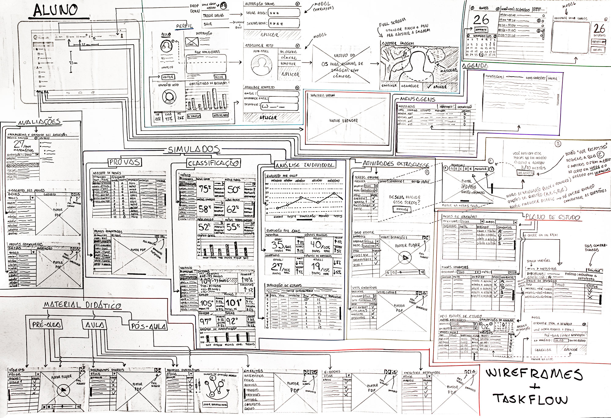
After the information architecture was built, the wireframes/task flow of the platform’s tablet version was designed. At this point, it was still in low fidelity in order to more closely align with the programming team. This first draft brought the challenge of how graphics and numerical information should be given a simple representation to become more understandable. After all, more than 40% of the screens had numerical information for decision-making.
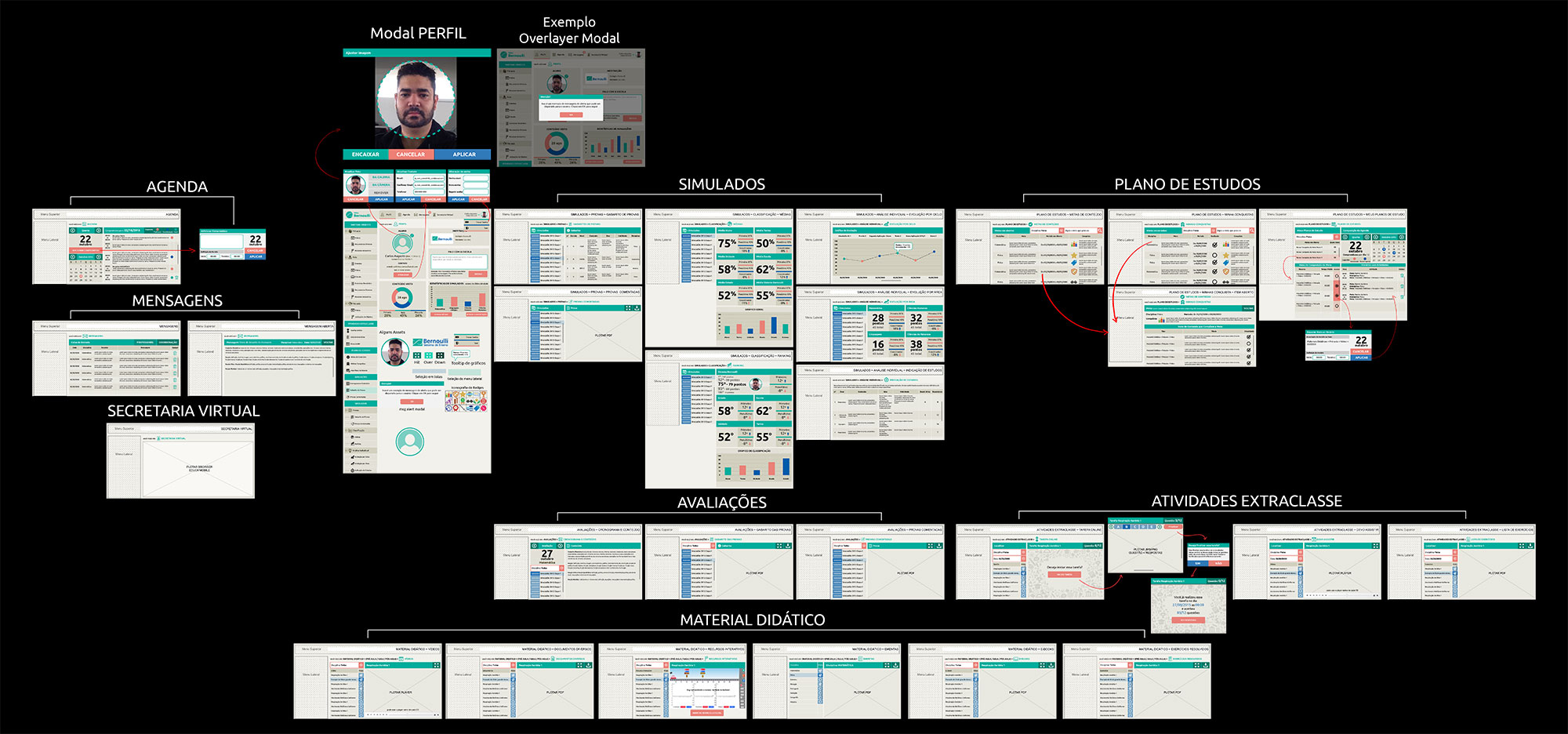
In the next phase, we moved on to high-fidelity wireframes, with navigation and screen sequencing aspects already established. We created a navigable digital model with buttons and tested it with students. After this phase, screens were exported for programming the native versions of the application.
